Branding Designs
Art and design is infamously subjective. One person’s trash can be another’s masterpiece. But luckily there is an age-old number that can help aid your designs into scientifically-proven beauty: the Golden Ratio Have you ever secretly wondered, ‘What’s so great about the Mona Lisa?’ The answer is the Golden Ratio.
Otherwise known as The Golden Section, Golden Mean, or the Greek letter ‘phi’, the Golden Ratio is a very handy number that helps you create beautiful, perfectly balanced designs that are aesthetically satisfying on a deep cerebral level. Cool, huh?
Although art and design are often led by instinct and creativity, the Golden Ratio uses mathematics to transform your image-making, layout, typography and much more. So let’s get into it
The Golden Ratio is the number used when two quantities are divided in a way that their ratio is the same as the ratio of their sum to the larger one of the two quantities. That number is 1.618, also called Phi.
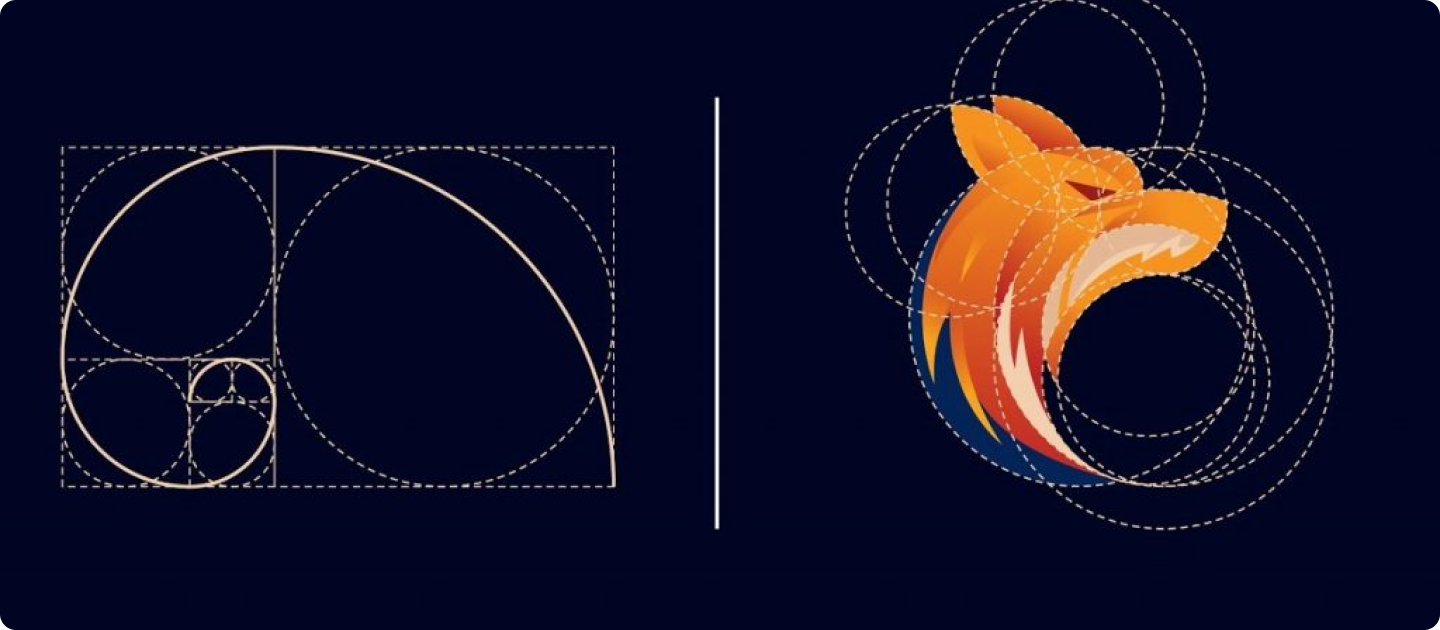
The easiest way to demonstrate this is by using the Fibonacci Sequence. Without going into too much detail, this sequence is the sum of the two numbers before it. So: 0,1,1,2,3,5,8,13,21…forever and ever (and ever). Back in the day, the Greeks used the Fibonacci Sequence to form a visual pattern to aid their designs. When you turn the sequence into squares and lay them side-by-side to create rectangles, a spiral (called the Golden Spiral) starts to form.

One of the best things about the Golden Ratio is that it gives you a simple number to help structure the otherwise expressive nature of design. Simply multiply an element’s size by 1.618 to figure out the size of another element, or overlay the Golden Spiral to adjust their placement. You can use the Golden Ratio to guide you in your layouts, typography, imagery and more.
We’ve put together four tips and tricks for how to use the Golden Ratio to maximize scientific beauty in your designs, da Vinci style.
When creating any design that uses text, always consider messaging hierarchy in your layout. Whether it’s a poster, a wedding invitation or a website layout, you can use the Golden Ratio to guide your typography sizes.
For example, let’s say when you’re working out your copy hierarchy for your really important text (A), your sort of important text (B) and your not so important text (C). If your smallest font size for (C) is 10px, then multiply that by 1.618 to get a rough guide for your larger sizes.
For example, let’s say when you’re working out your copy hierarchy for your really important text (A), your sort of important text (B) and your not so important text (C). If your smallest font size for (C) is 10px, then multiply that by 1.618 to
We are here to answer any question you may have.